 "Tareim - V8 powered" (tareimgaml)
04/02/2015 at 19:55 • Filed to: oppo, logo, lotus
 8
8
 10
10|
"Tareim - V8 powered" (tareimgaml)
04/02/2015 at 19:55 • Filed to: oppo, logo, lotus | 8
| 10 |
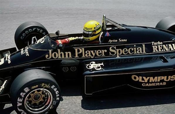
thought I'd join in with the logo creating with my attempt with Lotus in mind.
I did borrow !!!error: Indecipherable SUB-paragraph formatting!!! 's moppo logo as it was big enough for me to work on, if I spent some more time on it (maybe in the morning) I'd remove the gaps, it was a quick job as I wanted to get it up before I went to sleep

thoughts?
 CB
> Tareim - V8 powered
CB
> Tareim - V8 powered
04/02/2015 at 19:56 |
|
I like it. Looks good.
 SidewaysOnDirt still misses Bowie
> Tareim - V8 powered
SidewaysOnDirt still misses Bowie
> Tareim - V8 powered
04/02/2015 at 19:56 |
|
Just black and gold. Green and yellow has been tainted by the farce that was Caterham F1.
 carcrasher88
> Tareim - V8 powered
carcrasher88
> Tareim - V8 powered
04/02/2015 at 19:57 |
|
It looks awesome, but...
...needs more JPS font.
|
Tareim - V8 powered
> carcrasher88
04/02/2015 at 20:01 |
|
yeah that's another thing I'd look into if I put more time into it
|
Tareim - V8 powered
> SidewaysOnDirt still misses Bowie
04/02/2015 at 20:02 |
|
I can see where your coming from but would people get the connection if you just had the black and gold scheme?
 PS9
> Tareim - V8 powered
PS9
> Tareim - V8 powered
04/02/2015 at 20:03 |
|

Hey, check out my Ferrari themed oppo logo!
|
Tareim - V8 powered
> PS9
04/02/2015 at 20:08 |
|

|
SidewaysOnDirt still misses Bowie
> Tareim - V8 powered
04/02/2015 at 20:34 |
|
It's Oppo. I hope so?
 djmt1
> Tareim - V8 powered
djmt1
> Tareim - V8 powered
04/02/2015 at 20:35 |
|
OppositeLotus sounds like some weird sex parody on Yoga.
 pip bip - choose Corrour
> Tareim - V8 powered
pip bip - choose Corrour
> Tareim - V8 powered
04/02/2015 at 21:12 |
|
yep!